Abstract
The paper Cyclic Arbitrage in Decentralized Exchange Markets[1] showed a large number of occurrences of cyclic arbitrages in decentralised exchanges compared to centralised ones. In their work, they mainly focus on analysing these cycles in terms of length, token distribution, daily patens and profitability.
However, the factors driving their appearance have not been studied yet. To this end, we propose to extend the work of [1] on Uniswap data. Moreover, we also plan to study the predictive power of these factors in a binary classification setting. It will allow determining whether or not a cycle can actually be implemented and generate a positive return, which has an inherent market value.
Goal
The goal of this project is to study exploited cyclic arbitrage in decentralised exchanges. We already have access to the Cyclic transaction dataset which contains cyclic arbitrages that were exploited. We intend to extract features out of events (trade rates, trade volumes, liquidity) preceding the arbitrages.
These features could potentially be high dimensional (depending on the length of the time series) and we will need to use dimensionality reduction techinques to create an embedding to build a relevant set of features of our future machine learning models.
Then, we will cluster the arbitrages based on the computed features. Ideally, we would like to observe meaningful clusterings: profitable cycles get clustered together, cycles having similar duration (how long it is profitable) also end up in the same cluster, etc. Once meaningful clusters are obtained, it gets interesting to use the same features in a prediction model having profitability of the arbitrage as a target.
Data Acquisition
Data used in the study come from two different sources: information about exploited cycles comes from the dataset used in the arxiv paper. Data concerning rates preceding the cycles come are from through bitquery.
Dataset from the paper
We already have downloaded the dataset used in the arxiv paper. This dataset consists of arbitrage cycles that were exploited in the past. Each of these cycles is described by a path (the token swaps), a cost (gas fees), a profit, etc. It consists of a single JSON file and the downloading process is straightforward. The cyclic transaction dataset contains cycles of various lengths (number of tokens involved). The following figure displays the distribution of these lengths :
Note: this figure was replicated from the arxiv paper.
Moreover, to compute the embedding (next step) it would be more convenient to work on fixed-length cycles. Thus, cycles whose lengths are different than 3 are filtered out. The obtained data is called filtered_cycles_data.
While filtering, a new indexing system is created to identify cycles through an incremental cycle_id.
Custom extended dataset (Uniswap data)
As a second step, we construct an extended version of the cyclic transaction dataset as follows. For each cycle in filtered_cycles_data:
- We fetch from https://bitquery.io/ the exchange rates and gas prices of the
kpreceding the swaps present in the cycle path. This downloading process is more complex and needs to address some challenges. The free version of thebitquery APIthat is used for this project only allows a limited number of queries (10/min). To solve this issue we used EPFL’s cluster machine to query the API for a few weeks with a time delay between each call. To increase the throughput we used 2 API keys. For each given cycle infiltered_cycles_data3 calls are needed, one per edge of the cycle. - The fetched data is saved in multiple JSON files named
uniswap_raw_data_start_endwherestartandenddesignate the starting and endingcycle_idof cycles included in the file. We chose to use multiple files to avoid big losses in case of failure, these files are copied in safe storage as a backup. The files are then combined into a single pandas DataFrame nameduniswap_data.csv. We posted the dataset (splited files) on Kaggle
Each row contains information about a single swap :
cycle_id,token1,token2,baseAmount,quoteAmount,quotePrice,gasPrice,gasValue,time.
In the following section, we will only work on this extended dataset which is therefore referred to as the dataset.
Data Wrangling
Data Exploration
Before developing any machine learning model, we need to grasp a basic understanding of the dataset and its statistical properties.
As a first step, some basic descriptive statistics are shown.
| baseAmount | quoteAmount | quotePrice | gasPrice | gasValue | |
|---|---|---|---|---|---|
| count | 15000000.0 | 15000000.0 | 15000000.0 | 15000000.0 | 15000000.0 |
| mean | 617285.7691774105 | 713846.7959430087 | 2242173912899.245 | 220.7801204099542 | 0.039095987647290976 |
| std | 65344245.49678698 | 70486989.66812174 | 1692048320610068.8 | 358.3729580470268 | 0.07014017303962658 |
| min | -15.142535104 | -12.159705765907386 | -2524.8558484026958 | 4.0 | 0.000995174389907456 |
| 25% | 0.8133318661470393 | 0.9036593505321668 | 0.004853244571226323 | 38.999998464 | 0.0077283002647838715 |
| 50% | 12.397615 | 13.492995324544614 | 1.00714360456757 | 112.99999744 | 0.017265654713286657 |
| 75% | 452.1615419051607 | 437.5007715050853 | 210.47100813227757 | 337.500012544 | 0.05276144843830067 |
| max | 38617566009.5172 | 38617566009.5172 | 2.8893209691893514e+18 | 100000.00037683199 | 13.081600120162616 |
Since we are dealing with financial time series for the following features:
baseAmount,quoteAmount,quotePrice,gasPrice,gasValue
We will probably observe heavy tail distribution to some extent. It is what we are going to check first.
Note: in this section, no distinction is made between cycles. In other words, all data available is treated as a single feature, aka a single distribution. Indeed, understanding each cycle separately is a cumbersome process. Furthermore, it does not help in getting a global understanding of the dataset.
Note that only quotePrice and gasPrice are used as features for the embedding (in fact quotePrice = quoteAmount/baseAmount ). The distribution of quotePrice is shown below:
We observe that both features are extremely heavy-tailed. It is likely to cause some issues when used as features for machine learning models. As shown in the plot, applying a logarithmic transformation make the distributions more Gaussian (desired behaviour).
As a result, we computed again the basic descriptive statistics but this time on a log scale. We observe a better scale and the results are much more interpretable.
| baseAmount | quoteAmount | quotePrice | gasPrice | gasValue | |
|---|---|---|---|---|---|
| count | 14999899.00 | 14999852.00 | 14999751.00 | 15000000.00 | 15000000.00 |
| mean | 2.91 | 2.95 | 0.04 | 4.74 | -3.94 |
| std | 4.02 | 3.99 | 5.70 | 1.17 | 1.17 |
| min | -41.45 | -41.45 | -40.91 | 1.39 | -6.91 |
| 25% | -0.21 | -0.10 | -5.33 | 3.66 | -4.86 |
| 50% | 2.52 | 2.60 | 0.01 | 4.73 | -4.06 |
| 75% | 6.11 | 6.08 | 5.35 | 5.82 | -2.94 |
| max | 24.38 | 24.38 | 42.51 | 11.51 | 2.57 |
We also would like to draw the readers attention to the fact that this global heavy tail phenomenon also appears at the token pair scale. However, we observe more variability in the distributions. We took a liquid token pool (lots of transactions within a small time frame) to compute the following graph.
Furthermore, some tokens were partially illiquid which negatively affects the number of transactions available in the dataset. To better understand this phenomenon, we plotted the distribution of transactions per token pair.
Furthermore, it is likely that for illiquid Uniswap pools the time between the first and the last transactions reported differ quite significantly. In contrast, for very liquid pools, the time-span can be in the order of milliseconds. This discrepancy in the dataset could create some issues for the analysis performed in this study.
We provide more detailed information on the time-span distribution in the following plot.
A large disparity is observed with respect to the time span distribution. Furthermore, some transactions have more than 100 days gap for the same token which characterise the illiquidity of the underlying tokens. However, the observed median time span is still fairly reasonable: 1 day 21:52:20.
After a quick data exploration on these illiquid tokens, we realised they have a very different feature distribution than the other. They can be considered as outliers and therefore negatively impact the training of our machine learning tasks. Furthermore, one might argue that arbitrage on illiquid tokens are hard to realise in practice and they there is less incentive in studying them.
At this stage, we propose to develop two sub-datasets for the rest of the tasks, one qualified as full since it contains all cycles and another qualified as liquid containing only those that are considered liquid enough. Liquid tokens must satisfy the following conditions:
- The token has at least half of the transactions that should have been fetched (i.e. 300 out of 600).
- The token is in the
80%quantile of the time-span distribution defined above (i.e. span less than 15 days).
Then a cycle is considered liquid if at least 2/3 of its composed tokens are themselves liquid.
As we will later see, the full dataset is harder to train and we decided to only use the liquid at some point.
Data preprocessing
As it was previously said, the focus of this study is on cycles of length 3. We propose to model each cycle as a list of 3 nodes which are themselves represented as 2-dimensional time series: quote prices and gas prices. These time series have length at most P = 600 (transaction data fetched from bitquery).
Logarithmic transformation
As shown in section Data Exploration, it is probably a good idea to apply the element-wise logarithm to the quotePrice and gasPrice features as a first step.
Train/Test split
In order to test our models with the least amount of bias possible, we randomly split the datasets into a training and testing set (20%).
Scaling the features
To avoid the effect of the scales of the features in our results we have to re-scale them. To do so, we can consider two different approaches:
- Use a standard scaler that applies the following transformation to each feature \(x_i\) : \(x_i=\frac{x_i-\bar{x_i}}{std(x_i)}\) By doing so we obtain a dataset with zero mean and a variance of 1
- Use a min max scaler that reduce the range fo the features to [0,1] by applying the following transformation to each feature \(x_i\) : \(x_i=\frac{x_i-min(x_i)}{max(x_i)-min(x_i)}\)
After taking the log global features shown in the data exploration section somehow look Gaussian. Hence, we decided to opt for the standard scaler.
Moreover, token pairs can have very different scales in terms of quote and gas prices. Therefore, it might be worthy to define a custom scaling mechanism for each of these pairs. We refer to this as a TokenStandardScaler in the code.
As expected, the latter approach yields better performance in the following machine learning tasks. However, it requires more processing power than the first approach. We had to restrict the number of rows in the dataset to be able to leverage it.
Zero-Padding
In this study, each cycle is represented as a tensor with the following 3 dimensions:
| Name | Size | Description |
|---|---|---|
D |
3 | the length of the cycle, aka the number of tokens |
P |
600 | the length of the time series of swap transactions |
K |
2 | the amount of time series/features (quotePrice and gasPrice) |
However, due to lack of liquidity in Uniswap pools for a given pair of tokens, there could be less than P = 600 swap transaction fetched from bitquery. Since machine learning models are required to fix the input size for their functioning, we need to pad the shorter time series. To this end, the fixed-length P =600 was chosen, as well as the zero-padding technique for simplicity reasons. An extensive backtesting process could be performed later on (e.g. fixed or mean frequency between two cycles). However, due to time constraints, we decided not to explore further in this direction.
Note: in both train and test splits the
zero-paddingartificial values account for roughly17-18%of thefulldataset and10-11%of theliquiddataset. In the further steps section, we propose an alternative to reduce this overhead.
Building the feature tensor
The dataset is not directly shaped to build the tensor feature for the machine learning models. Indeed it simply contains a list of swap transactions in csv format. We need to massage it using multiple operations to group transactions associated with the same cycle together and pad each time series independently.
Note: hardware capacities of the cluster only allowed us to process
10 000 000swap transactions.
Cycle embedding
Movitation
In section Data preprocessing, we modelled each cycle by a D x P x K = 3 x 600 x 2 tensor. Hence, each of them is represented by 3600 parameters.
However, one could argue that 3600 is a too high dimensional way of encoding cycles. Especially given the fact we are dealing with financial time series containing lots of noise. Building a latent representation of cycles in which distances are more effectively modelled which can be a great use in further studies.
In fact, later on in this article, we are going to cluster cycles using the KMeans algorithm which heavily relies on meaningful Euclidian distances computation which can make great use of a dimensionality reduction.
To create this embedding, multiple approaches can be considered. We propose the following:
PCA is referred to in the literature as a simple linear projection operation. We plan to use it as a baseline comparison with the more complex autoencoder model.
The task of an autencoder is summarised in the following figure.

The dimension of the latent dimension Q determines the reduction factor optained through this process.
For example : with
Q = 100, the eduction factor is3600/100 = 36xwhich is non-negligible.
However, the more we lower Q, the more the signal is compressed which increases the amount of error in the decoding phase.
Using the PCA approach, we can easily understand how much is lost when Q varies.
In the Cycles profitability prediction task, we will be able to measure the gain of the embedding compared to the raw features (base model).
Autoencoder : different architectures
In this section, we tried multiple models (mainly focusing on autoencoders) for embedding computation through dimensionality reduction. As a first step, we trained the described models on the entire dataset that we have. However, we realized that some data points of the set were not liquid at all. These data points were represented by rates spanning over hundreds of days. The models performed poorly on this set so we decided to focus on liquid data only (see Data exploration section). Multiple optimizers (Adam,SGD,NAdam,Adamax,RSMprop) were tested for training. It appears that Adamax is the one working the best on these tasks. It was not always the case (no free lunch theorem) but Adamax was faster than the other optimizers by a factor of 10 when working on the liquid data.
Manually defining and testing architectures was a tedious and time-consuming task, multiple days of the study were dedicated to this section.
PCA
The first model chosen for embedding representation is a PCA having a latent space of 100 dimensions. note that dim=100 will be used for all next models. PCA only considers linear transformations. However, it is fast to train (around 30s in our case) and can act as a baseline comparison for other models.
Linear autoencoder
Secondly, we trained an autoencoder with linear activations only. The purpose of this choice is to compare the autoencoder architecture with the PCA. Indeed, when using linear activations on all layers of the model, it should perform similarly to PCA. Thus, we expect the performances of this model to be comparable with the ones of PCA.
The model consists of 3 fully connected linear layers, one of them being the bottleneck (dim=100).
It is trained using Stochastic gradient descent and the following losses are obtained :
Multilayer autoencoder
Let’s go deep! In this section, the number of layers is increased and activation functions are changed to be non-linear(elu,relu,selu…).
The neural network used here has 2 fully connected layers of 600 neurons each. They are symmetric to the bottleneck layer and uses elu activations.
Multiple activation functions were tested on this architecture and elu was retained to be the best one (based on test MSE).
This model is named fully_connected_3L and the obtained losses are:
Surprisingly, the best loss obtained by this complex model does not beat the PCA model. It is the reason why training goes up to 500 epochs. We wanted to see how the loss behaves and if it drops later on. But it did not happen. This model has the same number of layers as the linear one but it has mode neurons and the activations are more complex. Since the model is more complex we expect it to outperform the linear and PCA models on the training loss.
Note that more variants of neural network architectures will be trained and tested later on using the Talos library.
Convolutional autoencoder
To better capture the structure of cycles, we propose an alternative to the fully dense model of the previous section: a convolutional autoencoder. The motivation to introduce this complex architecture is that when a cyclic arbitrage is implemented, the first transaction could affect some price/gas of the second token and similarly for other transactions. The convolution operations could extract these neighbouring relationships between tokens to build a better latent representation of cycles.
We hope that a convolutional layer will allow us to leverage this structural bias.
First, we tried to train a simple CNN but it did not perform well. CNN are a simpler model than fully connected networks, having a limited number of parameters that are shared might cause some bias in the prediction. So we decided to add complexity to this model :
In addition to the convolutional layers of the network, we added 2 dense layers (in blue) of 300 neurons symmetrically connected to the bottleneck (Green). 4 Convolution layers (in red) are added. They consist of a 2D convolution layer followed by a max-pooling operation on the encoding side and an upsampling operation on the decoding side:

This model is named CNN_fully_connected and produces following losses :
Performance Analysis
The following figure illustrates the losses obtained by each described model :
As expected, the linear model’s performances are close to the ones of PCA. However, the results obtained for more complex models do not meet our expectations. The fully connected network and the CNN perform poorly compare to PCA. They should perform better on the training data at least because they are more flexible. PCA is restrained to linear transformations which is not the case for CNN_fully_connected and fully_connected_3L.
This poor performance might come from the choice of the network architecture: number of layers/neurons, activation functions…
To find the optimal architecture we tune these parameters in the following section.
Hyper-parameter optimisation
Now that we selected our main architecture for our autoencoder, namely a fully connected MLP, let’s optimise our loss. They are multiple hyperparameters that can be tune for this model. We selected the following :
| Parameter name | Option 1 | Option 2 | Option 3 |
|---|---|---|---|
activation function |
selu |
elu |
|
# dense layers |
3 |
5 |
|
# neurons in first/last layer |
100 |
300 |
600 |
dropout factor |
0% |
25% |
50% |
optimizer |
adam |
Adamax |
|
batch_size |
16 |
32 |
|
# epochs |
150 |
In order preform this best parameter search, we used the Talos python library which makes it fairly easy to test hundreds of parameter combinaisons in a few lines of code.
Note that the training of fully connected models tested previously converged around epoch 100. Moreover, Talos retained the best-obtained loss and corresponding training epoch. Thus we only chose one value for the # epochs parameter.
After running not less than 12 hours on the IZAR EPFL cluster, we got the following results:
| round_epochs | loss | val_loss | activation | batch_size | dense_layers | dropout | epochs | first_neuron | optimizer |
|---|---|---|---|---|---|---|---|---|---|
| 112 | 0.075 | 0.09 | selu | 16 | 3 | 0.0 | 150 | 600 | Adamax |
| 109 | 0.08 | 0.093 | selu | 16 | 3 | 0.0 | 150 | 300 | Adamax |
| 75 | 0.098 | 0.107 | selu | 16 | 3 | 0.0 | 150 | 300 | adam |
| 69 | 0.101 | 0.108 | selu | 16 | 3 | 0.0 | 150 | 600 | adam |
| 143 | 0.104 | 0.111 | selu | 16 | 5 | 0.0 | 150 | 300 | Adamax |
| 104 | 0.104 | 0.112 | selu | 16 | 5 | 0.0 | 150 | 600 | Adamax |
| 150 | 0.128 | 0.112 | selu | 16 | 3 | 0.25 | 150 | 600 | Adamax |
| 115 | 0.104 | 0.113 | selu | 16 | 3 | 0.0 | 150 | 100 | Adamax |
| 150 | 0.105 | 0.113 | selu | 16 | 5 | 0.0 | 150 | 100 | Adamax |
| 150 | 0.143 | 0.117 | selu | 16 | 3 | 0.25 | 150 | 300 | Adamax |
| 86 | 0.116 | 0.12 | selu | 16 | 3 | 0.0 | 150 | 100 | adam |
| 94 | 0.117 | 0.122 | selu | 16 | 5 | 0.0 | 150 | 600 | adam |
| 65 | 0.115 | 0.122 | selu | 16 | 5 | 0.0 | 150 | 300 | adam |
| 65 | 0.116 | 0.126 | selu | 16 | 5 | 0.0 | 150 | 100 | adam |
| 114 | 0.137 | 0.128 | selu | 16 | 3 | 0.25 | 150 | 300 | adam |
| 150 | 0.144 | 0.133 | selu | 16 | 5 | 0.25 | 150 | 600 | Adamax |
| 150 | 0.159 | 0.135 | selu | 16 | 3 | 0.25 | 150 | 100 | Adamax |
| 150 | 0.15 | 0.137 | selu | 16 | 5 | 0.25 | 150 | 300 | Adamax |
| 89 | 0.169 | 0.138 | selu | 16 | 3 | 0.25 | 150 | 600 | adam |
| 150 | 0.173 | 0.146 | selu | 16 | 5 | 0.25 | 150 | 100 | Adamax |
| 65 | 0.165 | 0.147 | selu | 16 | 3 | 0.25 | 150 | 100 | adam |
| 101 | 0.158 | 0.149 | selu | 16 | 5 | 0.25 | 150 | 300 | adam |
| 150 | 0.203 | 0.15 | selu | 16 | 3 | 0.5 | 150 | 600 | Adamax |
| 107 | 0.176 | 0.153 | selu | 16 | 5 | 0.25 | 150 | 100 | adam |
| 46 | 0.164 | 0.154 | selu | 16 | 5 | 0.25 | 150 | 600 | adam |
| 150 | 0.211 | 0.154 | selu | 16 | 3 | 0.5 | 150 | 300 | Adamax |
| 131 | 0.239 | 0.159 | selu | 16 | 3 | 0.5 | 150 | 600 | adam |
| 111 | 0.211 | 0.16 | selu | 16 | 3 | 0.5 | 150 | 300 | adam |
| 92 | 0.206 | 0.163 | selu | 16 | 3 | 0.5 | 150 | 100 | adam |
| 150 | 0.211 | 0.165 | selu | 16 | 3 | 0.5 | 150 | 100 | Adamax |
| 150 | 0.237 | 0.202 | selu | 16 | 5 | 0.5 | 150 | 300 | Adamax |
| 150 | 0.275 | 0.212 | selu | 16 | 5 | 0.5 | 150 | 100 | Adamax |
| 94 | 0.308 | 0.246 | selu | 16 | 5 | 0.5 | 150 | 100 | adam |
| 78 | 0.301 | 0.268 | selu | 16 | 5 | 0.5 | 150 | 300 | adam |
Talos has not finished running at the moment. But we already realize the Adamax works better than Adam on that particular task. The dropout seems to harm the performances. Model complexity (#neurons) is also a factor driving performance, the higher the complexity is the better the performance is. We realize now that 150 epochs are probably too small since a few models seem not to have converged after 150 epochs.
Note:
Talosdoes not supportK-foldcross-validation yet, so we had to use a single validation set (20%) for this task.
Cycles profitability prediction
Motivation
The goal of the project also consists of testing the predictability of the cycle’s profitability. The return of a given cycle is defined by its revenues minus its cost (fees). Profitability is a Boolean value indicating if the corresponding cycle has positive or negative profitability. Profitability is then used as a target/label for classification tasks. 95% of the cycles have a positive return. This imbalance can badly affect the training process. Indeed, a model that always outputs true will obtain a precision of 94% despite being meaningless. We proposed to deal with the imbalance through class weights in the loss function. The idea is to reweight the samples during training to obtain a 1 to 1 balance between positive and negative data points.
Method and features
Obviously, at first, the models will make use of embeddings produced by the encoding layer of the autoencoders as features. Multiple embeddings are tested (AE, PCA)
In our initial dataset, we also have access to the names of the 3 tokens participating in the cyclic arbitrage, which could potentially be used as extra features! However, machine learning models usually don’t like strings features. Let’s tokenize them! Since we are dealing with a fixed (categorical) set of non-ordered features, a one-hot encoding is probably a good way to go.
For instance, imagine we only have 3 tokens in our dataset :
ETH,DAIandAAVE
Then one could use the following one-hot encoding to represent them. We have 3 tokens so the encoding will be 3-dimensional
| Token Name | | | Dim 1 | Dim 2 | Dim 3 |
|---|---|---|---|---|
ETH |
| | 1 | 0 | 0 |
DAI |
| | 0 | 1 | 0 |
AAVE |
| | 0 | 0 | 1 |
From a linear algebra perspective, we observe that all rows have the same norm and are linearly independent, this is what makes this one-hot encoding an excellent choice for our purposes.
We draw the attention of the reader to the fact that these extra features should not be added as an input to the convolutional autoencoder. Indeed, there is no translation bias to exploit here. In order to ease the performance comparison with other types of embedding models, we decided not to use them in any of the embedding related tasks.
To sum up, two different sets of features are used as input for prediction:
Embeddings.Embeddings + tokens.
These two types of features are used and the scores are compared to see if the names of the involved tokens bring relevant information to the prediction.
Finally, we need to select a performance metric to compare our models. Usually, for binary classification tasks, the accuracy is chosen. However, it is probably not a good chose here since we have a strong class imbalance. Indeed, using accuracy the trivial model that outputs always true will have a high performance and this is not what we want. Hence, we will investigate the differences in terms of precision and recall, in particular through the f1-score metric which is a geometric mean between precision and recall.
Different models
Logistic regression
The first model consists of logistic regression. It is fitted on the standardized embeddings using a grid search cross-validation process to tune the hyperparameter C (regularizer). The following confusion matrices (one per type of features) are obtained on the test set :
Embeddings confusion matrix :
| / | True(pred) | False(pred) |
|---|---|---|
| True(real) | 657 | 530 |
| False(real) | 25 | 29 |
Embeddings + tokens confusion matrix :
| / | True(pred) | False(pred) |
|---|---|---|
| True(real) | 829 | 358 |
| False(real) | 36 | 18 |
Corresponding f1 scores :
| / | Embeddings |
Embeddings + tokens |
|---|---|---|
| f1 score | 0.703. | 0.808 |
Support vector machine (SVM)
The second model is a support vector machine trained on the standardized embeddings to find the optimal boundary between profitable and non-profitable cycles. Again, cross-validation is used to tune the hyperparameters. Namely: the kernel of the SVM (linear, rbf, or poly) and the regularizer (C). The selected model produces the following confusion matrix on the test set :
Embeddings confusion matrix :
| / | True(pred) | False(pred) |
|---|---|---|
| True(real) | 1192 | 0 |
| False(real) | 49 | 0 |
Embeddings + tokens confusion matrix :
| / | True(pred) | False(pred) |
|---|---|---|
| True(real) | 1155 | 37 |
| False(real) | 46 | 3 |
Corresponding f1 scores :
| / | Embeddings |
Embeddings + tokens |
|---|---|---|
| f1 score | 0.9799 | 0.9653 |
Despite rebalancing the classes, it appears that the SVM models always predict true and reaches an f1 score of 0.9799. Even though this model reaches the best performance, it’s a trivial model.Surprisingly, including the tokens encoding does not improve the performance when using SVM as a classifier. The f1 score decreased but now the model does not behave trivially (always outputting True).
Global Interpretation
Given the result above, we can conclude that there is some predictability in the one-hot encoding of the token since the f1-score raised from 0.70 to 0.8 in the AE case. We also wanted to stress that all models usually experience some difficulties when it comes to predicting non-profitable cycles.
Please note that the models were trained on a subset of the data because of limited computational capabilities. Using the entire set of data would for sure increase the scores.
Investigation of the different embeddings performance
To evaluate the performance of our cycle embedding (autoencoder), we propose to study the impact of different embeddings features on the output of a binary classification task, precisely the profitability of a cycle.
The emphasis is not put on finding the best overall model here. The idea is to study the difference in the confusion matrix and metrics (accuracy, f1-score, recall, precision) that occur when the input features change.
If we observe better performance metrics for our autoencoder embedding, this experiment will have provided evidence that our embedding somehow captures the underlying structure of cyclic arbitrages.
Method
To this end, we propose to study 3 different types of embedding :
- The AE embedding (base hypothesis)
- The PCA embedding (alternative hypothesis 1)
- A rule-based embedding using technical indicators (alternative hypothesis 2)
If the first two options are described in detail in the earlier steps of this project, it is not the case for the third one.
The following rolling indicators are used :
- SMA
- Rolling volatility
using two different rolling windows (5 and 20).
These indicators are applied on the following underlying time-series data (for each cycle):
Quote priceGas price- Log-returns of
Quote price - Log-returns of
Gas price
In other words, for each cycle, we construct 4 * 2 * 2 = 16 features.
After zero-padding the tensor build is of shape N x 3 x 600 x 16.
Note: the
NaNintroduced by the computed are filled using0to have comparable shapes with the AE features.
Again since we have a massive imbalance between classes the accuracy metrics needs to be avoided. We will investigate the differences in terms of precision and recall, in particular through the f1-score metric.
Results
For the standard AE embedding, the confusion matrix is available in section Logistic regression.
The PCA confusion matrix is show below
| / | True(pred) | False(pred) |
|---|---|---|
| True(real) | 814 | 373 |
| False(real) | 34 | 20 |
with a f1-score of 0.800
For the rule-based encoding, we have
| / | True(pred) | False(pred) |
|---|---|---|
| True(real) | 977 | 210 |
| False(real) | 42 | 12 |
with a f1-score of 0.886
Unfortunately, the conclusions that were drawn in the Performance Analysis section of the AE training can also be applied here. Namely, the AE is not able to reach the same level of f1-score as the PCA and rule-based embedding.
We would like to draw the attention of the reader to the fact that even though the MSE Loss was higher for the AE than for PCA, it is not obvious that the performance of embeddings themselves are comparable in the same way. Indeed, the AE was trained to produce reconstruct the input data not to construct a relevant embedding in the latent dimensions.
Cycle clustering
Motivation and method
Cycles clustering can be understood as an unsupervised method to classify cycles into a given (k) number of categories. The clustering assignments provide a natural way of grouping cycles together. Statistical analysis can be conducted on the clusters to understand the general structural properties of the dataset.
To this end, we will start by studying the output of a standard clustering algorithm named K-means.
Which embedding ?
Given the poor results of the AE embedding in the previous tasks, we first try to use the PCA embedding in this section. However, for almost all k values, most of the data points are clustered together (see example below for k = 22)
Furthermore, we observed little persistence for the patterns observed on the training train and test sets (especially when k increases). In other words, a KMeans model trained on training set will probably not hold enough predictive power to be used test set which makes it almost useless in practice. This is mostly true for the k-1 small clusters.
However, surprisingly, using the AE embedding, the performance is improved. Clusters are much more balanced and we observe more predictable behaviours between the training set and test sets. Therefore, we propose to conduct the following analysis using the latter embedding.
Choosing the right value for k
The starting point of the analysis is to understand which values of k (the number of clusters) lead to a relevant clustering assignment. silhouette and sse plots are the standard way to go.
Usually, we should observe a maximum spike in the silhouette method plot. This is not the case here. The curve has a clear growing trend but there is no clear reason, at least for our analysis, why we should go above 20 clusters. Hence the silhouette plot is not particularly useful in the task of choosing the best k.
However, the elbow method applied on the SSE graph seems to indicate that the steepest slope is in the range $[0, 22]$. For $k > 22$ there is less evidence than, increasing k improves the quality of the clustering.
Individual area silhouette scores are also worth looking at. They can be found in the next plot, sorted and grouped by clusters for convenience.
Since the elbow method did not allow us to exclude any values of k before 20e).
Therefore, we propose to further investigate k=4, 9, 16, 22 which may be fair tradeoffs between the goodness of the fit and the number of clusters. In the following plot, we will investigate the quality of the individual cluster to choose our final value.
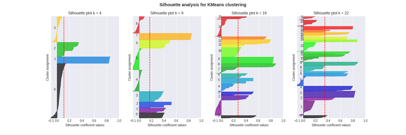
Guidelines to interpret the plot:
- Silhouette scores can be interpreted as follows :
- 1 indicates that the sample is far away from the neighbouring clusters
- 0 indicates that the sample is on or very close to the decision boundary between two neighbouring clusters
- <0 indicates that those samples might have been assigned to the wrong cluster.
- On the y-axis, the width of clustering is an indicator of the number of data points assigned to the cluster.
- The red line indicates an average threshold. Bad clusters are those that fail to reach that target for all data_points assigned to them.
Key observations from the plot
- For
k = 4:- The below-avarage ratio is 20% (number of below average clusters divided by
k) - Only cluster 0 is below average (red dotted lines) but it is the largest cluster.
- The laregest clusters (0 and 3) contain negative silhouette scores
- The below-avarage ratio is 20% (number of below average clusters divided by
- For
k = 9:- The below-avarage ratio is 33%
- Negative silhouette scores occur in 33% of the clusters
- Clusters 4, 5, 8 look terrible (lots of negative values and below average score) and contain lots of data point
- The other clusters are fairly shaped and look decent
- For
k = 16:- The below-avarage ratio is 25%
- Negative silhouette scores occur in 31% of the clusters
- Clusters 1 and 14 are bad
- Clusters 4 and 7 almost reach the average target
- All other clusters look good
- For
k = 22:- The below-avarage ratio is 27%
- Negative silhouette scores occur in 27% of the clusters
- In this case only cluster 5 contains very negative values
- However most clusters that are below-average fail to meet the required target by a large value
- Cluster contains, on average, less data points than for
k = 16
Overall, we observe high variability in the silhouette scores for all values of k. There is no clear answer to which value of k is best. However, in our opinion, the plot suggests that k = 16 may be slightly better.
Clustering validation
In this section, we aim to provide the reader with evidence that the clustering contains useful information (aka clustering assignments are neither random nor trivial, all cluster are in the same cluster).
In other words, using relevant metrics, we need to demonstrate dissimilarities across clusters that are also persistent on the test set.
For instance, we could consider the following :
Number of cycles per cluster: a sanity check to understand the overall quality of the clustering. Indeed, if99%of cycles are clustered together, we won’t be able to extract meaningful information out of the clustering.Profit per cluster: we would expect to observe clusters more profitable than othersProfitability per cluster: this metric is related to the risk associated with a cluster. Indeed, some clusters could be less profitable than others (on average) but yield a higher probability to make a profit in the end. It s the type of analysis that we would like to conduct with this metric.Token distribution understanding per cluster: one desirable property of an interesting clustering could be to observe important differences in terms of token distribution across clusters. For example, computing themedianof the distribution would allow us to understand whether or not only a few tokens that are very profitable or not are used. Furthermore, the entropy of the distribution can be used as a comparison to a random clustering.
These metrics, computed on the training set, are shown below.
At first sight, it already looks quite promising. We can group clusters together in terms of behaviour. There are two main trends :
- Profitable clusters (group
A):12,3,4,9,10,12,13,14 - Less profitable clusters (group
B):56,7,8,11and15
Let’s dive into the details :
- Group
Aappears to be the one generating the larger amount of profits, with slightly better profitability but nothing astonishing. - On the contrary, group
Bis below average in terms of profits. - There are no outstanding differences in terms of profitability across clusters. However, one should note that the global average is already at
95%which shows that most of the cycles are profitable anyway. - Clusters
2and12(which below to groupA) contain far more data points than the others. - When it comes to the token distribution entropy, group
Ais more random than the rest. However, there is no clear difference in terms of the median distribution across groups. - The full token distribution plots show that clusters grouped together (
AandB) follow a similar distribution. For instance, for groupB, there is no bulk at the very left but rather a smaller bulk around mid-right. Since we are dealing with a less profitable group, by hovering the plot, we may be able to identify tokens that do not have a very good overall performance.
In the following set of plots, the same metrics are recomputed but this time on the test set. Interestingly, the conclusions that were drawn for the train set can be extended for the test, demonstrating some degree of predictability/persistence.
Conclusion
The acquisition of data took was time-consuming though we managed to create a big set of data in relation to the one used in the arxiv paper. Data exploration demonstrated the diversity of the data in terms of distribution and liquidity as well.
To build effective features for our machine learning models, we had to perform numerous data wrangling steps. Among others, a token-based scaling was applied and missing data were handled through `zero-padding
The Autoencoder gave us a tough ride. We had to test many different training/test sets and architectures to construct a relatively sound model. In the end, only the most liquid tokens are used to compute 100-dimensional embeddings using autoencoders and PCA. Unfortunately, they did not reach the expected performance regarding the reconstruction MSE. We could not manage to overperform PCA.
Then, we proposed further tests for the quality of the autoencoder. In particular, we first started to build a binary classifier for the profitability of the cycle. Multiple models (logistic regression, SVM) were contrasted to better understand what accuracy we can expect in this task. We also noticed that the addition of the involved tokens has a positive impact on the prediction. However, in the end, the result obtained leans towards the hypothesis that the PCA embedding yields better results than our AE embedding.
Finally, we used clustering methods to analyse the structural properties of cyclic arbitrages. As expected, the clustering based on liquid embeddings produced clusters where profitable cycles were clustered together. In contrast to the previous observations, the most satisfactory clustering assignments were obtained using the AE method.
The conducted study can be improved: models used for embedding extraction are not satisfying (MSE wise). Nevertheless, possible areas of improvement are described in the next section.
Further steps
We concluded the project, but there is still lots of opportunities for improvement. Some of them are described below.
Embedding improvement
Attention Learning
In section Data preprocessing, 0-padding was introduced to standardise the length of each time series. However, the choice of 0s is rather arbitrary and can introduce many problems upon training the autoencoder (as well as scaling the data). Indeed, a small computation shows that introducing this padding technique adds 7 500 000 000 zeros which corresponds to a fraction 17% of the training set entries. This means that the autoencoder can do a decent only by trying to improve the reconstruction of 0sis the training set.
Moreover, if we keep increasing the number of padded Os, we can make the MSE arbitrary close to 0 (perfect model).
These undesired behaviours could be addressed by introducing a special token PAD which has no intrinsic value.
A classical way to solve this problem is to use attention learning as we have in Natural Language Processing tasks such as the BERT Transformer model.
The idea is to define, for each data point, a mask containing 0 and 1 entries that specifies which part of the data point shall be considered valid by the Neural Network layers. This mask is therefore passed along each layer, until the final loss function which is only be evaluated for the valid (non-padded) entries.
Keras offers two build-in constructs for mask-generating layers: Embedding and Masking.
Using them would increase the quality of the embedding. However due to time constrains, we did not consider it in this study.
Circular Convolutions
In the above sections, we defined a fairly complex convolutional architecture for the autoencoder. In the scheme, we use standard zero-padded convolutions. However, due to the cyclic nature of the arbitrages, a possible improvement would be use circular convolutions instead. However, since no default implementation in keras was available, a custom layer needs to defined.
Since this process is time consuming and error-prone, we decided to stick with keras basic implementation but circular convolution is definitely a step that is worth exploring.
In depth comparision
The performance of the encoder could be compared with more complex embedding techniques than PCA such as Fourier/Wavelet transform or Signature transform.
Clustering improvement
If we increase the quality of the embedding, the clustering quality should increase as well. However, we can further back test the clustering algorithm by comparing KMeans with BDscan for instance.